
Designed the system that turned an unmeasurable therapy experience into real, trackable clinical data, laying the groundwork for outcome-based care.
Role
Sole Product Designer
Team
Industry
Health Tech
B2B2C Mental Health
Timeline
Nov 2025 - Mar 2026
Overview
Intellect had no reliable way to show whether therapy was actually working, for users, their providers, or the employers paying for it. Only 12.5% of users completed a quick clinical check-in (PHQ4) before their sessions, so any claim about outcomes was guesswork. As the sole designer on this project, I took it from an open-ended brief to a shipped system: a redesigned assignment flow, a new low-friction nudge, and a Progress page that turns raw clinical scores into something a user, a provider, and an employer can each actually use. Assessment coverage rose from ~77% toward a 100% target, and early signals show real clinical improvement for the users completing it, alongside an honest, harder finding about what still isn't solved.
Background
Intellect is a mental health platform serving individuals, and (critically for this project) employers who offer it as an employee benefit. The industry was shifting toward outcome-based pricing: competitors were beginning to offer performance guarantees tied to measurable improvement. Intellect had no comparable data to stand on.
Problem
The brief started open-ended: how do we show that someone's mental health is improving, in a way that means something to a user, a provider, and an employer, all at once?
The number that made it concrete: only 12.5% of users completed PHQ4 (a validated 4-question depression/anxiety screener) before a therapy session. Without that data, any outcome claim was guesswork, and worse, the data Intellect did have likely skewed positive, since only the most motivated users were completing an optional check-in.
Three audiences, three different needs, one dataset:
Users wanted progress to feel like their own story, not a clinical test
Providers needed something clinically actionable, fast, going into a session
Employers needed something aggregatable and defensible for an ROI conversation
Process
Mapping the option space before sketching anything.
Before committing to a direction, I brainstormed the realistic ways "progress" could even be measured, since each one served a different audience: a validated clinical instrument (defensible, comparable, but historically low completion), a lightweight pulse-check (low friction, but not clinically grounded), goal-based tracking (personally meaningful, but impossible to report on at an org level), or a provider-rated approach (clinically sound, but adds real workload). The tension underneath all of it: users want progress to feel like their own story, providers need something clinically actionable, employers need something aggregatable. No single format cleanly serves all three, and that tension shaped every decision after this.

Diverging before converging and leaving the placement question open.
I ran a crazy 8 session with VP and Design manager, twelve unique directions, scored with a hidden vote (3 yes / 1 no tokens each). Several of those directions were really about where the entry point should live, Care tab, Explore, a dedicated tab, Home, Daily, Profile, and I kept revisiting that same set as the project developed. I ruled most of them out for reasons that only became clear later:
Assessments felt too clinical and buried (confirmed by my own later audit),
a dedicated tab would be disproportionate to an audience that's mostly power users, and
replacing Daily would have sacrificed a genuinely valuable habit-formation feature for convenient real estate.
With no clean slot available anywhere, I made a deliberate scoping call: park the entry point in Profile as an interim placeholder, and spend the effort on the page's actual content instead of forcing a placement decision prematurely.

Finding the right moment to ask for PHQ4 (Patient Health Questionnaire-4)
The real question here was where to place the ask without adding friction that worked against the goal. I mapped a low-fidelity, sticky-note-annotated flow testing four moments:
a homepage nudge (reusing the existing NBA card pattern, low-friction, and the one that actually shipped),
a pre-join popup (rejected, since a first-time user already hits a stack of prompts before joining, emergency contact setup, an early-join warning, permissions, and I'd missed that on the first pass, a gap that came from transitioning off consumer work into my first B2B project),
an in-call prompt (rejected outright by engineering, since the video SDK had no picture-in-picture support and triggering an assessment mid-call would end the session), and
a post-session reveal (shelved, since I couldn't reliably know whether a given user's score had actually improved by that moment, and a mistimed capture risked injecting misleading data into the very system meant to be trustworthy).
Three of the four got cut. The homepage nudge is what shipped.


A backend fix that came before any new screen.
Working with our PM, I helped close a structural gap: the original logic auto-assigned PHQ4 48 hours before a session, but only if none had been assigned in the prior two weeks, which left real gaps for anyone in weekly sessions. The updated logic moved the trigger to 24 hours and removed that gating rule. This also surfaced a real edge case: a session booked at very short notice could still fall outside the 24-hour window entirely. The proposed fix, documented as an experiment rather than a confirmed build, was to trigger assignment at the moment of booking instead of on a countdown, but only for bookings under 48 hours, since triggering it for every booking (including ones made weeks out) would mean capturing a score that's stale by the time the session actually happens.

Learning from competitors and our own product.
I audited Modern Health and Spring Health directly, and ran the same critical eye over Intellect's own existing assessment history page. The competitors taught me what not to do: bundling too many assessments in one sitting (high effort, low completion), collecting goals with no measurable payoff, and showing a flat number with zero interpretation. My own product's audit, done screen by screen with red sticky notes, surfaced a subtler bug: months with no data were rendered as a score of zero, which reads as decline, not "not measured", plus a page that was actually a webview embedded in the native app, confirmed by a native text-selection menu appearing over the chart. I also checked Apple Health specifically for how it handled no-entry, single-entry, and multi-entry states, which directly informed the fix for that zero-score bug.

Starting from a system-level map…
Our PM had already mapped the system-level shape of this: every entry point PHQ4 could come from (a user starting it themselves, a provider assigning it, or it coming through support/CareNav), how severity should route to different recommendations, and open questions like how coach-assigned versus clinician-assigned cases should differ. My page-level architecture decisions had to fit inside that map, not be designed in isolation from it.

Iterating on the page's structure with the team, and drawing a clear line
on what not to interpret
The page needed to be modular from day one, since more assessments were coming later, and a raw name like "PHQ4" or "WSAS" means nothing to a user. The plan: link assessments to goals instead, "Mental Wellbeing" instead of "PHQ4," "Work-Life Balance" instead of "WSAS," with one goal eventually mapping to multiple assessments. That meant building components as true building blocks. But the goal-to-assessment mapping still needed clinical validation that hadn't happened, so I cut scope back to PHQ4 only rather than ship an unapproved taxonomy.
From there, I iterated with the VP, design team, and PM: rough UI, feedback, revise, repeat, until the structure held. We kept anchoring to one job for the page, show current state, trend, next action. We also drew a line on depth: providers get question-by-question detail, users get the score, the trend, and what it means, and neither gets our interpretation of what a score means for them personally. That's not ours to say. We left it to the person who actually knows them, their therapist.

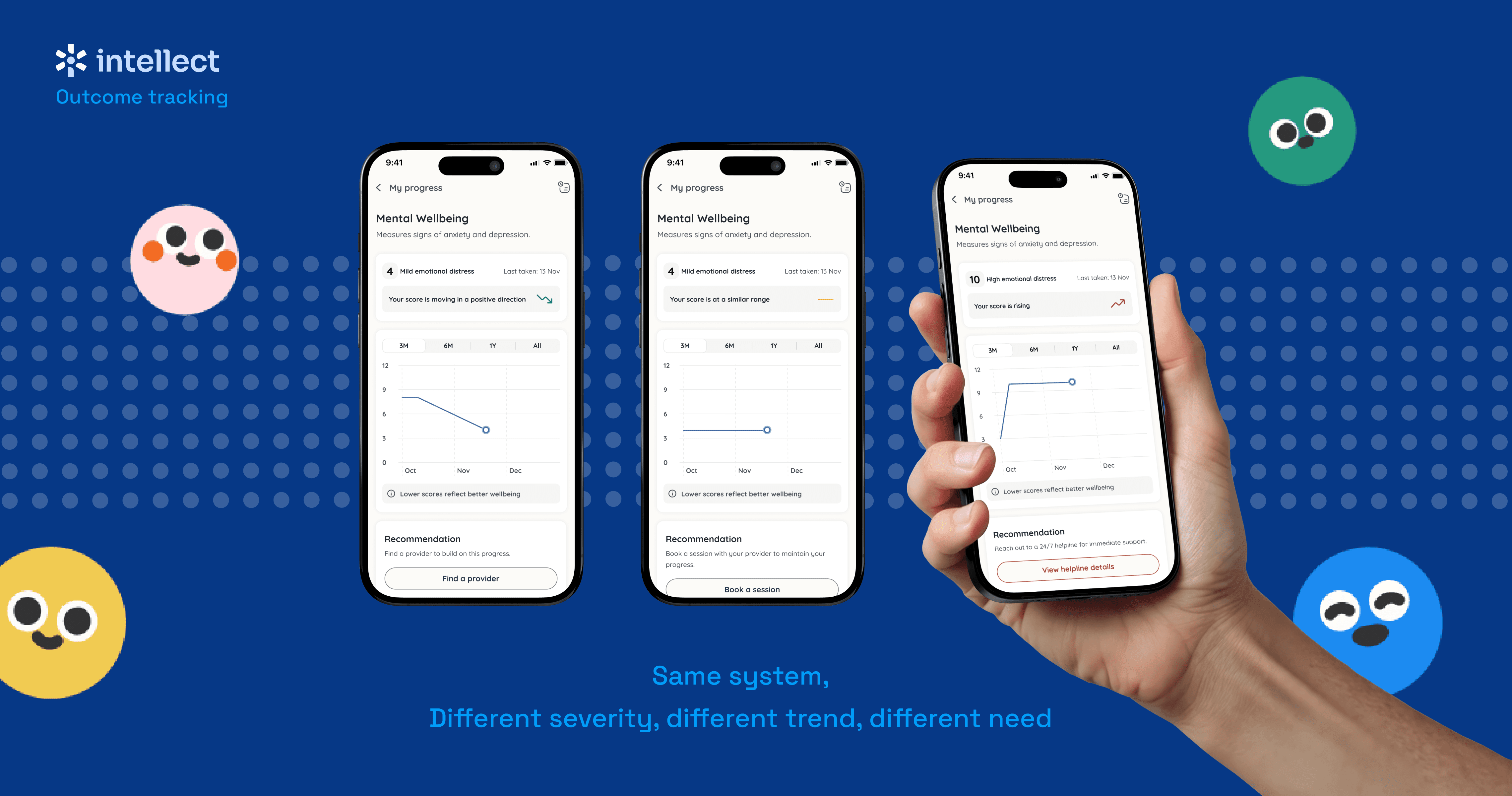
One reviewer questioned whether a green "improving" arrow could ever sit next to a "Severe" label and look contradictory, which led me to simplify the card design itself: the current score and severity now use a neutral text color, and color is reserved only for the trend indicator, removing the visual clash regardless of the underlying score math.
Another reviewer caught that I was breaking a real principle by offering two competing CTAs, Retake and Book a Session, on one screen. I'd actually pushed to keep Retake myself, since it felt like a natural action to offer, but deferred to the team's read that a page should only ever push one primary action; retake stayed reachable through the standard Explore path instead.
The homepage nudge went through its own dedicated finalization round too, comparing a calendar illustration (chosen, since it evokes an upcoming event and prompts mental preparation) against a provider-forward alternative that was seriously considered for being warmer and more localization-safe.
Designing the copy system, end to end.
It started with severity-driven copy: low scores got reassurance, moderate scores named the likely experience directly without alarm, and high scores led with 24/7 crisis support at the top of the screen, overriding every other piece of logic, since someone at that severity can't wait for a scheduled session. My first instinct was much more granular, differentiating "plateaued at mild" from "plateaued at moderate", which I walked back myself once I recognised I had no defensible basis for judging one plateau as better than another. I simplified to one consistent tone per trend direction, deliberately generic rather than presumptive, given how sensitive that judgment call is in a mental health context.

Building the full state matrix and CTA logic.
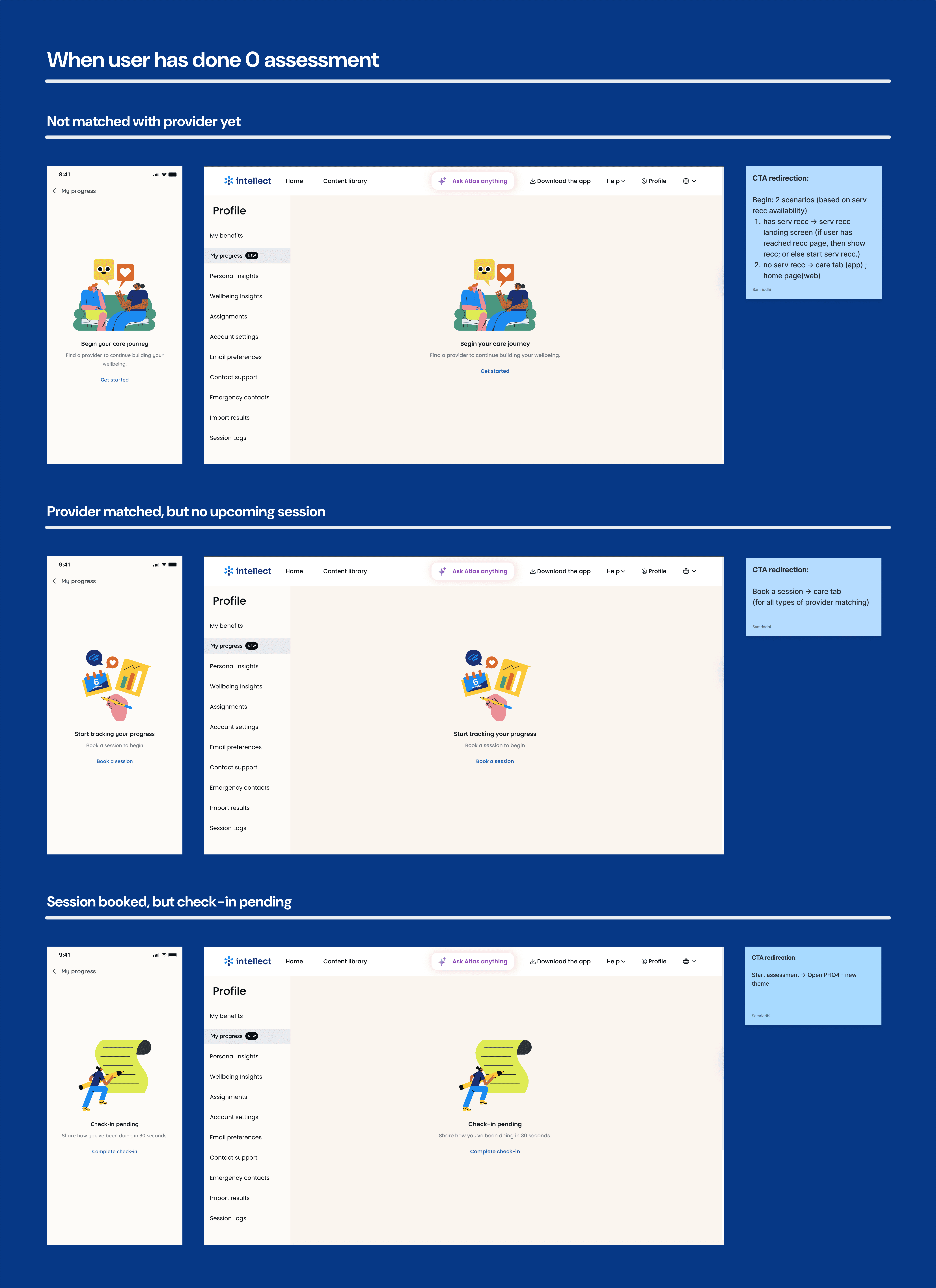
The recommendation had to hold up across severity (Minimal, Mild, Moderate, Severe) crossed with care status (no provider, provider matched but no session, session booked, or session booked with the assessment already done), each with its own copy and CTA rather than a generic fallback, "no provider" points toward finding one, "session booked, assessment pending" nudges completion with a low-pressure "Complete" CTA rather than "Start" (chosen specifically since "Start" implies new effort, the wrong signal for someone already carrying enough), and once everything's done, the CTA disappears rather than staying stale. I also mapped the actual routing logic behind each CTA, including a real edge case: if a user's org has the Care tab disabled entirely, "Find a provider" falls back to the homepage instead of leading nowhere.
Stress-testing across every real state, not just the happy path.
First-time users with no assessment, returning users with a trend at every severity level, a full provider/session state matrix (no provider, provider matched, session booked, assessment pending, all done), and a localization pass across English, Hindi, Indonesian, Tamil, and later German, Tagalog, checking that copy length and tone held up, not just that it translated correctly.
Taking it to the clinical team instead of guessing on sensitive calls myself.
I asked directly: should we show the exact score and its band together (yes, for transparency), are the standard bands correctly labeled (numbers were right, but language needed reframing, "Severe" and "Normal" read as alarming or stigmatizing, so we moved to "emotional distress" framing plus a disclaimer that this isn't a diagnosis), and what's the safest structure for recommendation copy (their answer: trend plus user status, e.g. "improving with no provider" gets different copy than "improving with a session already booked", not raw score alone).
Building it as a real component library, not a handful of example screens.
Beyond individual screens, I built variant-based components for every piece that needed to render differently by state: the trend indicator (3 variants), the graph (6–8 variants crossed by score band or trend, further crossed by tap or hover), and the recommendation card (15 variants each for mobile and web, covering every score/trend and CTA combination). I also resolved a real technical question mid-build: when multiple assessments land on the same calendar date, the line moves between them at a shared x-position rather than rendering overlapping points, with only the most recent entry showing a marker to avoid visual clutter.

Final Product
A backend fix that came first.
Working with our PM, the assessment-assignment logic changed from a gap-prone 48-hour trigger to a cleaner 24-hour one, closing most of the coverage gap before any new screen even shipped.
A low-friction nudge.
A homepage card, reusing an existing pattern, appears 24 hours before a session, framed as a quick ~30-second check-in, not a task.

The Progress page.
A state-aware view of the user’s emotional well-being, evolving with every assessment. It moves from meaningful empty states to score-based guidance and, as more assessments build up, clear trends across improving, stable, or declining progress. Recommendations adapt to severity and care status, with consistent handling for pending check-ins, missing plans, and fallback states—so every state has a clear next step, never just a number without meaning.


Impact
Assessment coverage: ~77% → ~100% target,
per the shipped assignment-logic change (48h→24h trigger, gating rule removed). One known edge case remains: sessions booked at very short notice (e.g. through an internal/backend channel rather than normal booking) can still fall outside the 24-hour trigger window entirely. A fix was proposed (assign at the moment of booking for sub-48-hour bookings) but wasn't confirmed shipped at the time of writing, so I'm not claiming full 100% coverage without qualification.
An early clinical signal:
users with an elevated baseline saw an average ~2.5 point PHQ4 improvement after 3 sessions, for roughly 60% of them.
The honest finding:
the original 12.5% completion rate itself hasn't moved much yet. Fixing coverage and fixing completion turned out to be two different problems: the real next lever is likely structural (in-session completion, provider incentives), not another nudge. I'd rather report that plainly than overstate a clean win.
Reflection
This was my first end-to-end B2B project after building Intellect's consumer product from scratch, and the biggest lesson was learning to audit a mature product's existing constraints before proposing something new: a gap that cost real rework early on, and one I closed by building that audit habit into every round after. I also learned to hold a strong opinion (like wanting to keep a Retake option) while still deferring to a team's collective read when the reasoning was sound. What's next: in-session completion, provider incentives tied to completion, and expanding beyond PHQ4 to other clinical assessments, building on a system that was designed to scale from day one.